Author:
Source
Sponsored:
Working in Public: The Making and Maintenance of Open Source Software - Audiobook

Unlock the Digital Creator Code!

Universities and colleges are faced with unique goals, challenges, and opportunities around digital transformation. We often hear from folks who want to reorient their higher education websites around attracting and nurturing potential new students. I recently shared insights on how to accomplish this at the 2023 HighEdWeb Conference in Buffalo, New York, where I co-presented with Winna Tse and Vibeke Silverthorne from OCAD University.
We showcased our collaboration on OCAD U’s Admissions sites—two visually bold, accessible, interactive microsites that we designed to captivate a creative audience and streamline the application process. OCAD U saw a 21% increase in website visits and a 15% increase in applicants within a few weeks of the launch.
In this article, I’ve shared some of our best lessons and findings from the project. Read on to explore six proven ways to reach, engage, and win over prospective students.
1. Consider Building a Separate Microsite
According to usability research, students often select a program first before they choose which school to attend. That means it’s really important to show prospective students what programs are available and make program pages easily accessible. Many websites successfully use a program finder on their main website to funnel prospective students to their program of choice.
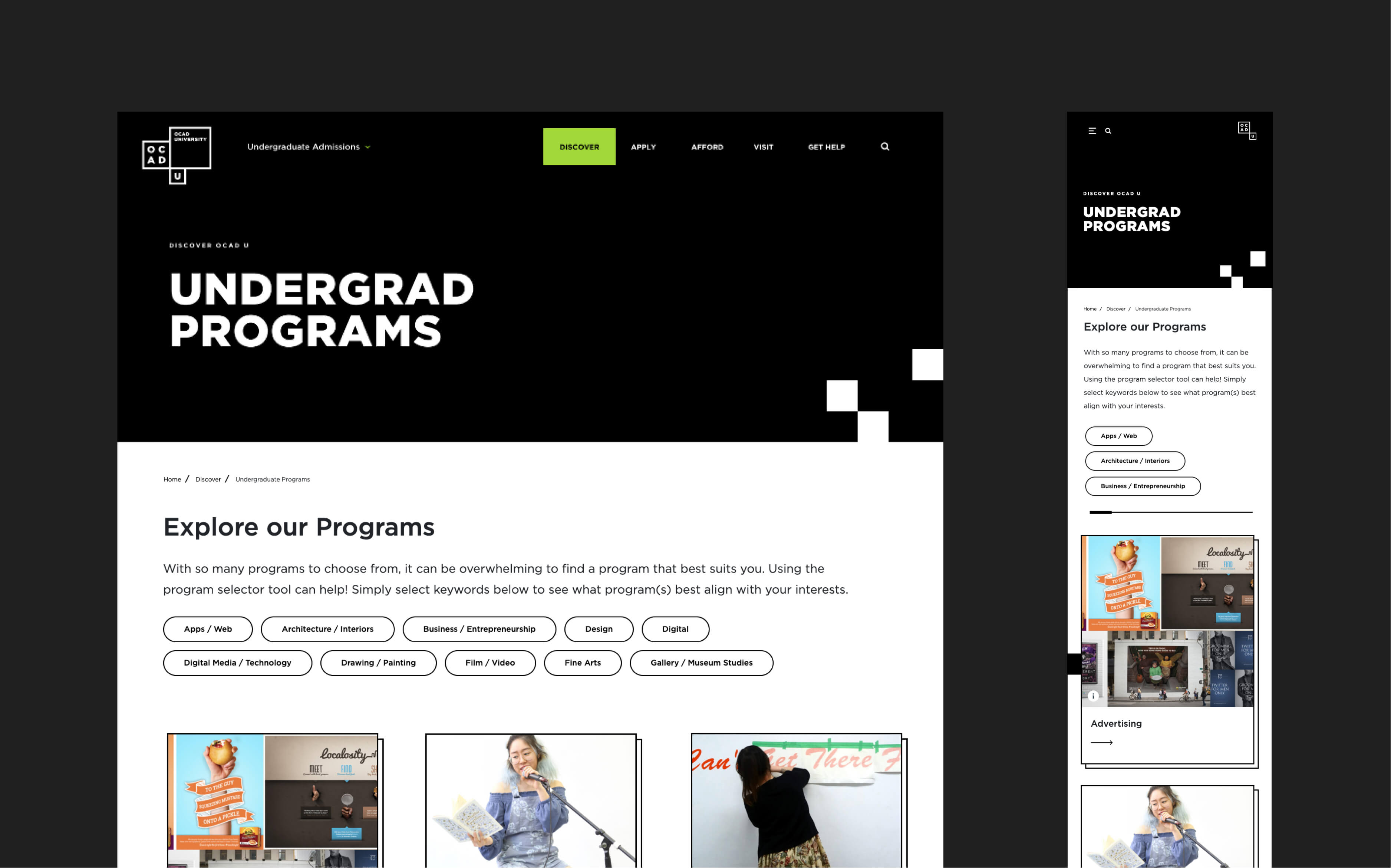
But because OCAD U had information architecture issues on its main site, we recommended replacing the old admissions section with two stand-alone microsites targeted at prospective students (one for graduates, one for undergraduates). This solution brought several advantages for OCAD U’s admissions team and the wider university, which we’ll explore below.
Targeted user experience
By capturing prospective undergraduates on a self-contained microsite, OCAD U can deliver a highly tailored digital experience. Everything from the menu navigation to the visuals are geared towards users who’re considering studying at the university. OCAD U was so happy with this approach that they commissioned a second microsite aimed at prospective postgraduates.
Streamlined updates process
Originally, the admissions team had to ask the marketing team to make content changes. Every department did this, meaning it could take 2-3 weeks for requests to reach the top of the queue. This wasn’t practical for the fast-paced nature of admissions and recruitment.
A stand-alone microsite gives the admissions team greater ownership over their content. They can make changes in a single day, enabling them to publish time-sensitive content such as deadlines reminders.
Because the microsites are built using Drupal, the admissions team has access to a powerful user roles feature for managing editing permissions. This is one of many reasons to use Drupal for higher education websites.
Possibilities for experimentation
OCAD U’s admissions website created an opportunity to experiment with the visual brand and user experience. It offers more freedom and breathing room than the main website due to its size and age. What’s more, the university can learn from the admissions website and apply lessons from its successes to the main website.
Alternative: Program Finder
A separate microsite was the right choice for OCAD U, but another strategy is using a program finder on both the main and recruitment site to funnel users towards detailed program pages. This approach is particularly effective for institutions with multiple campus websites, as it offers a versatile starting point for program exploration. For OCAD U, the decision to go with a microsite stemmed from a lack of flexibility with the information architecture on their main site, making a microsite the obvious choice. For other institutions, the program finder funnel solution might make more sense.
2. Create Straightforward User Journeys
Because you’re competing for the time and attention of prospective students, it’s all the more important that your website serves up the information they’re looking for quickly and effortlessly. The best way to achieve this is by mapping user journeys and working out how to streamline your site architecture, search experience, and calls to action.
User Journey Mapping
We ran a user journey mapping exercise with OCAD U where we developed user personas and explored the types of interactions they had with the university. This included everything from Googling the institution, to attending an open day, to completing an application form. The process helped us uncover new opportunities to improve their journey, and allowed us to start developing wireframes and mockups.
User Mindsets
Using a less traditional approach, we also explored user mindsets. Our team identified three mindsets that any prospective student might have—whether they’re a high schooler, undergraduate, mature student, or coming from abroad:
- “I don’t know what I want to study.”
- “I want to study art and design, but I don’t know where yet.”
- “I already know that I want to attend OCAD University.”
Looking into these mindsets with OCAD U helped us shape their site navigation and provide relevant, consistent CTAs. Their Discover section is aimed at the first mindset, the Afford and Visit sections at the second mindset, and the Apply section at the third mindset.

Want to learn more about the discovery and UX design in higher education projects? Read about our collaboration with York University’s School of the Arts, Media, Performance and Design in 5 Surprising Findings That’ll Change How You See Discovery.
3. Integrate Storytelling Throughout Your Content
Storytelling creates an emotional connection between users and your brand. The most powerful stories are authentic and value-based, showing target audiences that you care about what they care about. Storytelling isn’t just for your homepage either. Program pages are a common entry point for prospective students, so they need to promote your brand as well as the course details.
As an art, design, and media institution, OCAD U has incredible opportunities to use visual storytelling. We infused a range of student-created art throughout the university’s website. Not only does this elevate the design, it also showcases talent that reflects OCAD U’s reputation, and invites prospective students to imagine their own creative possibilities.
“We felt that [Evolving Web’s] aesthetic was very strong, that they could really adapt to our brand. Also, most importantly, was their thoughtful approach to storytelling.”
– Winna Tse, Communications & Projects Specialist, OCAD University
Having worked with dozens of higher education institutions, our team has interviewed many prospective students about what matters to them. We’ve heard repeatedly about the importance of connecting with current students and alumni. Prospective students value hearing about real-life experiences at your university—in fact, it’s often a tipping point in their decision making process. So, don’t isolate student stories and testimonials in a corner of your website. Integrate them on every page to ensure exposure to your most persuasive content.

4. Fine-Tune Your Visual Brand
An eye-catching, memorable visual identity sets your university apart from competitors. Above all, it needs to resonate with your target audience. Building a new website is often a good opportunity to refresh your brand—but it’s possible to refine what you already have in a way that targets prospective students.
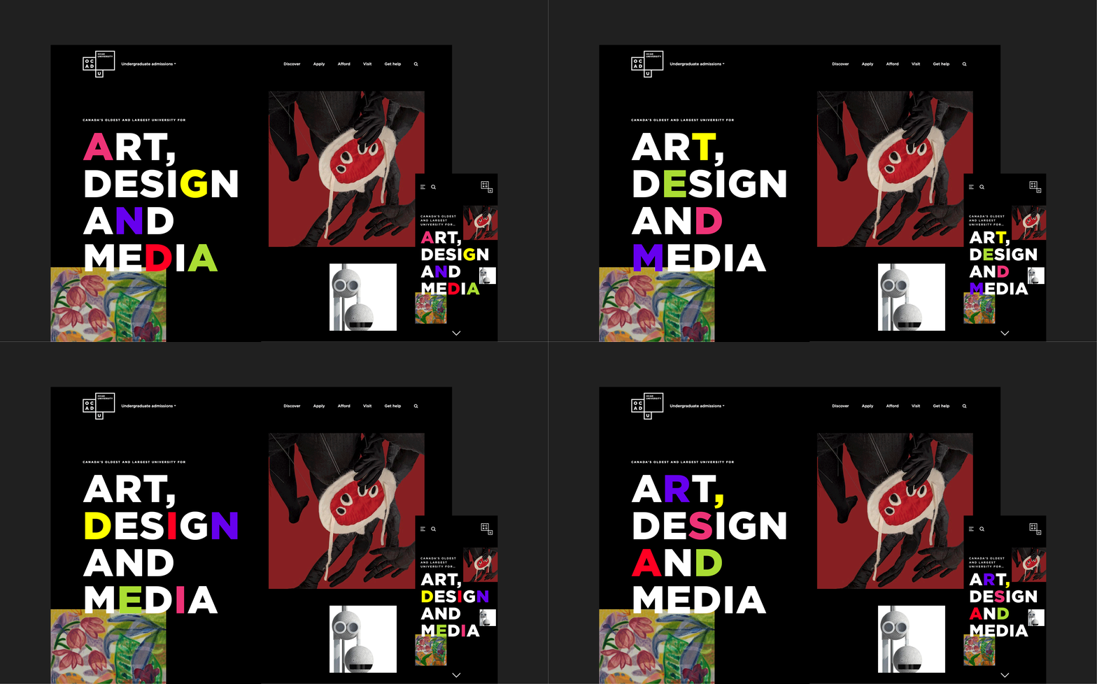
Identify where your brand allows for flexibility, and experiment with different flavours of existing design elements. OCAD U wanted a bolder look and feel that reflects their reputation and meets the expectations of discerning young creatives. So we found ways to use their visual identity in new ways, bringing out more daring and fun aspects of the brand.
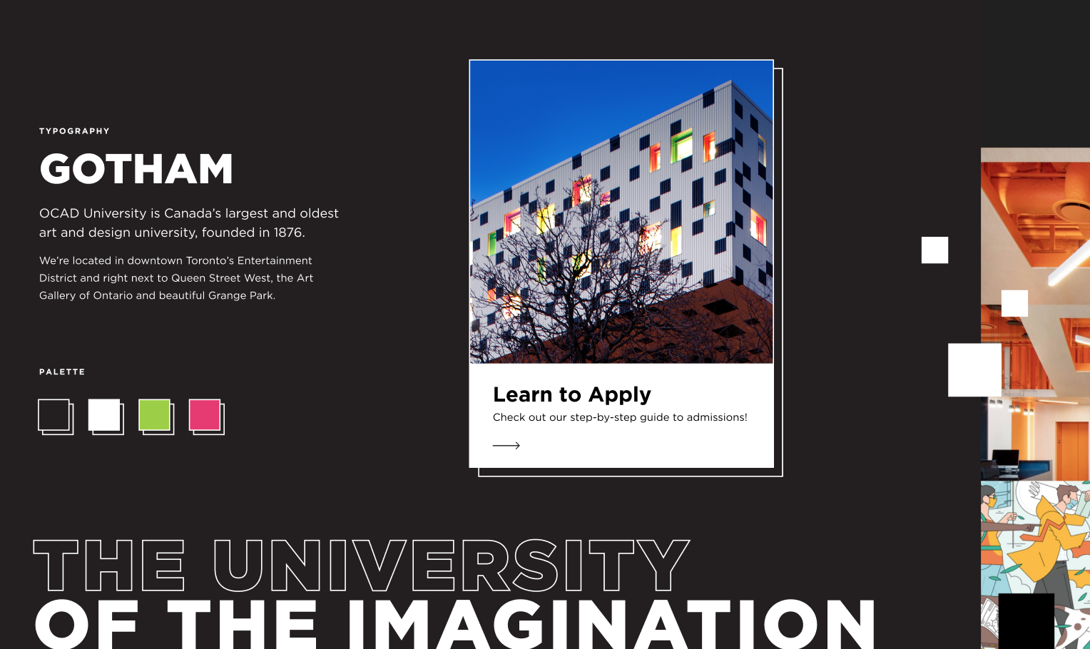
Our design team developed ‘Windows into OCAD U’, a concept that invites students to explore creative possibilities, escape the boring, and reimagine a more fantastical reality. We also used the distinctive architecture of OCAD U’s buildings as inspiration for textures and shapes, including tiled patterns, concentric squares, and boldly coloured buttons.
We communicated our vision to the client using stylescapes, a valuable tool for enhancing collaboration on art direction.

5. Help Prospective Students Apply with Confidence
If you want to increase applications from prospective students, it’s essential to make the admissions process as straightforward and welcoming as possible. A useful exercise is to identify major touchpoints in the user’s journey and find ways to provide better support and value around it.
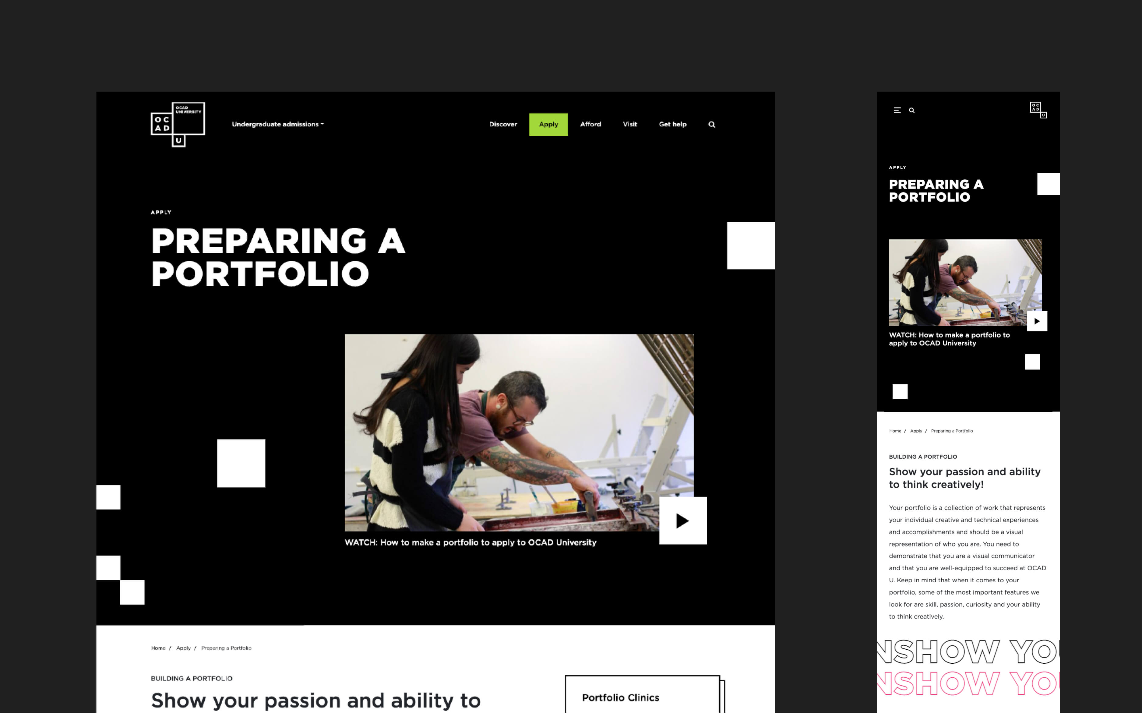
For OCAD U, this touchpoint was when prospective students prepared and submitted their portfolio. For other universities, it might be something like attending an open day or having an interview with faculty.
We helped OCAD U develop a dedicated page for portfolio preparation. It offers step-by-step guidance, information about requirements, creative prompts and tips, answers to common questions, and access to portfolio clinics. By providing these valuable resources, OCAD U saw an increase not only in the number of applications but also in their quality.

6. Prioritize Accessibility and Inclusion
Prospective students come from a wide range of cultures and backgrounds, and include people with disabilities and support needs. Higher education institutions need to prioritize accessibility and inclusion when building a website, ensuring that everyone has equal access to content and feels welcomed and represented.
Everything our team builds complies with WCAG 2.0 AA and relevant federal, provincial, state, or local requirements. But we encourage and guide clients to go beyond these standards with a human-centric, personalized approach to web accessibility. This can empower your organization to reach even more people and offer ever-better experiences.
It’s also important to represent your institution’s diversity into your site’s content strategy. Select website imagery that represents people of various cultures, races, ethnicities, religions, and so on that represent that diversity you would find on campus. Diversity can also mean highlighting different paths to success, such as showcasing someone who is a mature student that went to OCAD to start a second career. Prioritize plain language to help non-native speakers and users with cognitive disabilities to find the right information. Consider whether you need a multilingual website to cater to audiences such as international students.
Finally, explore ways to support prospective students from historically underserved communities. As a North American university, OCAD U has a dedicated section for indigenous applicants that provides tailored information about relevant resources, contacts, programs, scholarships and bursaries.
Meet Evolving Web, Your Digital Agency Partner
Evolving Web works with higher education organizations across North America—including Princeton University, McGill University, Georgia Tech, the University of Washington, OCAD University, Queen’s University, York University, and the University of California Berkeley.
Our experience has allowed us to develop best practices and tried-and-tested solutions that help us deliver exceptional value to our higher education clients. We create dynamic, user-centric websites to help you connect with target audiences and cultivate valuable relationships. Our team prioritizes your digital independence, giving you the tools you need to grow and evolve your digital presence.
Learn about our work with higher education clients and see what we can do for you.


