Waktunya Tidur Siang @mrlubai #mrlubai #komedi #meme #funny #Shorts #lucu #lol #kocak #viral…
Author: Source Read more
Author: Source Read more
#viral #we #are #celebrating #our #republicday #viral #online #special #event #youtubeshort #video
We are celebrating our Republic Day on every year on 26, January | I am making a short video for my viewers | I hope you will like, please like comment, share this video.
I also requesting to my new viewers to subscribe my You Tube Chenal .
————————————————————————————————————————-
Thanks For Watching.
——-Visit Again——–
——–LOVE YOU———
————————————————————————————————————————————————————————————————————————-

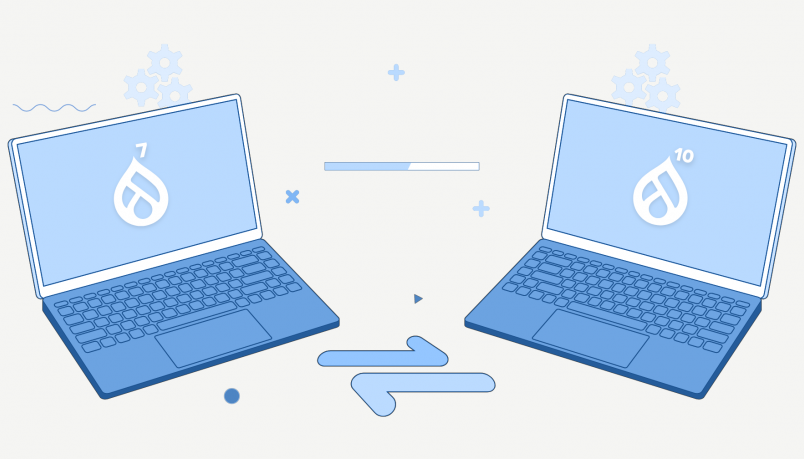
%20(1).png?itok=swvFp-Es "OpenSense Labs: Top 4 Reasons Why You Should Migrate from Drupal 7 to Drupal 10")
Drupal 10 released in December 2022 and ever since, the community has been pushing its users to migrate to the latest version.
As many as 54% of all Drupal sites are running on Drupal 7.
Using an outdated version has downsides. Businesses miss out on technological advancements and new features that can speed up and safeguard their digital properties.
With the release of Drupal 10 and the fact that Drupal 7 will reach end of life in November 2023, it is crucial to migrate to Drupal 10 soon. Here’s why enterprises should plan their Drupal 10 migration now, and not wait until the last moment.
Drupal 10 brings automated updates, improved user experience, along with several other feature additions. These components will be more secure, user-friendly, and powerful. Let’s dive deep into why enterprises must plan their Drupal 7 to 10 migration.
The simple finding and installation of modules should empower Drupal newcomers as well as “ambitious site builders” – Dries Buytaert.
Drupal work on current supported PHP versions. Recommended PHP versions are the best choice for building a Drupal site because they will remain supported longer. Drupal 10 is built on PHP version 8.0 while 7 isbuilt on PHP 7 which is also reaching end of life. This creates technical dependencies in supporting the platform better.
The Drupal 10 core will be updated to eliminate a few modules that are redundant or are not frequently used. For uniformity, these modules will be transferred to the Contributed Module area.
You will have to leave Drupal 7 behind. Eventually, the opportunity cost of continuing to use software that is more than 10 years old is substantial, and once it is considered End of Life (EOL), the risk and expense of an uncovered vulnerability increases rapidly.
There are several possibilities available to you, and you have an additional year to choose and make plans for one of them. The ideal option will rely on the expertise level of your team, the amount of business logic you have included into Drupal 7, and your projected budget.
Drupal 7 will reach end of life in November 2023, Drupal experts recommend that organizations begin migrating to Drupal 10 soon and not wait till November 2023.
If you want to migrate your website to Drupal 9 and prepare for Drupal 10, you may rely on our Drupal migration skills and expertise.
OpenSense Labs, as a Drupal partner, is committed to providing active support. Contact us at hello@opensenselabs.com for a long-term and fruitful collaboration.

The post What ChatGPT learned about the LFX Mentorship Showcase appeared first on Linux.com.

The License Review Working Group concluded its review of the license review process and is making recommendations for modification to the process. The next step is community review and input.
More MCC East Bay:
Calendar of Events: http://www.mcceastbay.org/calendar
Weekly Updates: http://www.mcceastbay.org/newsletter
Support MCC: https://www.mcceastbay.org/sadaqa
Facebook: http://www.facebook.com/MCCPleasanton
Instagram: https://www.instagram.com/mcceastbay
watch it on web browser like chrome or firefox to activated the subtitle.
if u watch it on phone or iphone app it cannot show the subtitle.