Author:
Source
Sponsored:
Working in Public: The Making and Maintenance of Open Source Software - Audiobook

Unlock the Digital Creator Code!
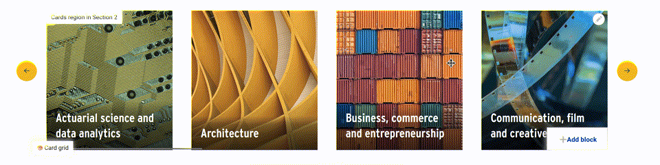
In this post, we explore building a cards section with Layout Builder.
The component will look something like the ‘Services’ section on our homepage*. If you’ve built websites over the last decade, you’ve probably built a component like this many times.

The key aspects of the component are
- A title
- Some intro text
- A series of cards. Each card has a URL, title, image and teaser text
If you’ve previously used paragraphs for modelling landing pages, you may immediately be thinking that your content model will be made up of paragraph type ‘cards’ with three fields as follows:
- A title
- A teaser field for the intro text
- A multi-value cards field, which is itself another paragraph type ‘card’.
Or rather, because this is Layout Builder, you might be thinking of a block-content type called cards with those fields on it — leaning on paragraphs for the multi-value cards field.
Whilst that approach works well for paragraphs, it isn’t the best approach for Layout Builder:
- There are some gnarly bugs with Layout Builder + Block Content + Paragraphs + Content moderation
- It requires content-editors to fumble in the off-canvas editor to rearrange each card using drag-and-drop. We want a nice re-order experience like this:
Making the most of layout plugins
Let’s instead pivot to a layout plugin for the cards component and think of it in terms of regions.
We have:
- A layout title
- An introduction region
- A cards region
We probably already have a block-content type that consists of a WYSIWYG field — e.g., something like the Basic block content type in core. We can use that for the intro text.
So we need a card block content-type. But we probably want two. A lot of our cards will just point to other pages on the site — and it makes sense for the card to be built from fields on that page. If we put a teaser image and teaser text field on all our node-types, we can make use of them when creating a card for that page. We can also use these for meta-tags like the OpenGraph image. And all our node-types already have a title and URL. The second block-type is if we need to link to pages outside the site. So, the content models for those two block types are as follows:
- For the internal card block-type, we need an entity-reference field to allow the content-editor to select the content to generate the card for
- For the external card block-type, we need all the fields — title, image, teaser, URL
Defining layout plugins
Next, we need to define our layout plugin. We start with a layouts.yml file in our theme or module.
cards:
  label: Card grid
  category: Layouts
  template: layouts/cards
  icon_map:
    - [intro, intro, intro]
    - [c1, c2, c3]
    - [c4, c5, c6]
    - [c7, c8, c9]
    - [c10, c11, c12]
  regions:
    content:
      label: Cards
    intro:
      label: Introduction
  library: 'your_theme/card'
Note: the icon_map isn’t needed here, but it gives us a nice icon in the ‘Add section’ form.
With those pieces in place, we can use Layout builder restrictions to ensure only the right block-types can be placed in each region. The introduction region can be limited to the basic WYSIWYG block-type. The cards region can be limited to the internal and external card block-type.
This layout will use the default layout plugin, but we want a custom layout plugin with a title field in the configuration form. You can read more about creating a custom layout plugin from our previous post about creating a dynamic layout with flexible regions. This one will be much simpler. We just need a title field in the configuration form and a preprocess hook to expose that to our template.
The first step of this is to add a ‘class’ entry to our layout definition.
cards:
  // ...
  class: Drupalyour_themeLayoutsCards
  // ...
Then, we need to create that class.
<?php
namespace Drupalyour_themeLayouts;
use DrupalCoreFormFormStateInterface;
use DrupalCoreLayoutLayoutDefault;
/**
 * Defines a class for a layout that has a title option.
 */
class LayoutWithTitle extends LayoutDefault {
  /**
   * {@inheritdoc}
   */
  public function defaultConfiguration() {
    return parent::defaultConfiguration() + ['title' => ''];
  }
  /**
   * {@inheritdoc}
   */
  public function buildConfigurationForm(array $form, FormStateInterface $form_state): array {
    $build = parent::buildConfigurationForm($form, $form_state);
    $build['title'] = [
      '#weight' => -10,
      '#type' => 'textfield',
      '#default_value' => $this->configuration['title'],
      '#title' => $this->t('Title'),
      '#description' => $this->t('Provide an optional title for this section'),
    ];
    return $build;
  }
  /**
   * {@inheritdoc}
   */
  public function submitConfigurationForm(array &$form, FormStateInterface $form_state): void {
    parent::submitConfigurationForm($form, $form_state);
    $this->configuration['title'] = $form_state->getValue('title');
  }
}
Then, in your theme you can preprocess to make this variable available to the template.
/**
 * Implements hook_preprocess_HOOK().
 */
function your_theme_preprocess_layout(array &$variables): void {
  // Add the title from LayoutWithTitle.
  $variables['title'] = $variables['content']['#settings']['title'] ?? NULL;
}
For optimum UX, we’d probably want to make Layout Builder Browser blocks, too. You can read more in our previous post about our approach to Layout Builder UX.
All that remains then is to theme the block-content types to match the design. For more on that, see our previous post on theming block-content types with Layout Builder.
As an extra enhancement, you could add integration with Layout Section Classes module to give content editors additional options like the number of cards shown across the page in the card grid.
Note: this component on our website is automated and built with Views, but there is often a need to build out curated equivalents.